Doing my part to help breasts
STIPIMM: Theme song to “The Tom and Jerry Show”
My dad always told his sons to “always take pride in your work.” Actually, that’s crap; he never said any such thing. Or maybe he did, but I don’t remember it. My dad said a lot of pithy things, some of which I remember and try to live by, with questionable success (“Never get married and have kids!” or “Change the oil!”), but “take pride in your work” wasn’t one of them. I just thought that sounded like a good way to start this post, which involves taking pride in a particular aspect of my work.
I tell people that I’m a “graphic designer for H&R Block,” which is incorrect in two ways. One, I don’t technically work for H&R Block, but one of their subsidiaries. And two, there’s isn’t much “designing” to my job. Perhaps a better job title would be “graphic imitator.” I’m supposed to take state and federal tax forms and duplicate them as closely as possible using our very limited software. Nine hundred ninety-nine times out of a thousand, this simply involves laying text boxes, straight lines, and boxes down on a page, basic layout stuff. As a result, the software we use limits us to a very small palette of tools: text (that can only go horizonally), horizontal and vertical lines (no diagonals), rectangles, circles and ovals and isosceles triangles. And we have three colors available to us: black, white and mid-gray.
But every once in a while, there’s that one time out of a thousand, when we have to use a little bit more than simple duplicative skills to make the form look like the original. Many times the states put various logos or images on their forms. And because of the primitive quality of our software, we can’t import image files or the like. Most of the time, as in the case of state seals, we don’t have to try to duplicate them and all is well. But sometimes we do, and sometimes it’s not so easy. Some examples of things that had to be drawn in the past on tax forms: a mailbox (with the flag up), an eagle flying, a hand signing a signature. If we were able to use such software as Adobe Illustrator or Macromedia Freehand, these things would be a snap. But no, we are stuck using that limited palette. It’s hard to really describe, but try to imagine having to draw a duck with only rectangles, ovals and basic triangles (none of which can be rotated). But someone did last year, very well I might add:
 Here’s another way to think of it: Imagine if I asked you to draw a black diagonal line using only what I described. How would you do it? You’d first draw a triangle, one of whose edges would end up being the diagonal line. Then you’d draw another triangle, this time all white, and cover up the rest of the first triangle, leaving only a black diagonal line on a white page.
Now image having to compose something with lots and lots of diagonal lines.
Added to the difficulty is that we can’t scale the images. That is, they have to be drawn to actual size; we can’t draw them big and shrink them down later. It’s like doing microscopic surgery… well, nothing like that really. But the principle of working in a very small area with limited tools applies.
Up to now, I’ve never had to really drawn any intricate logos. The most complicated things I had to draw were a smiley face and a frowny face (yes, there are sadistic state tax agencies that put emoticons on your tax forms next to your refund or the amount you owe, respectively). Today, that changed. The state of Wisconsin informed us that we needed to include a tiny breast cancer ribbon next to the “Breast cancer research donation” line on their main form. Now, consider your average lapel ribbon: not a straight horizontal or vertical line on the damn thing. So it would be tough. And tough it was.
I started creating the logo around 2 p.m. this afternoon. At around 2:45 (oh, I probably took a break to check e-mail or something), I finished a rough version that I could copy on the form to see if it would fit. Of course, it didn’t; it was about 50 percent too big for the space allotted. And remember, I can’t scale the thing down, so I basically had to redraw it from scratch. It didn’t take as long the second time, but still. By the end of it, once all the fine-tuning had been done, I had used almost 40 boxes/ovals/triangles to create that ribbon. For the convenience of my audience, I made a copy of the draft and changed all the graphic elements to transparent boxes with black lines, so you can see just how complicated a graphic it really was:
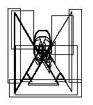 Of course, that’s not what you’d see on the page. What you’d see is a nice little ribbon. And when I mean little, I mean little:
 That’s actual size, folks (forgive the resolution and image noise; you'll just have to trust that it looks good in PDF format). A tiny little logo, but I must say, I am particularly proud how well this sucker turned out. Doesn’t look complicated, and none of the customers in Wisconsin who see it will think much of it, but then, that’s the point isn’t it? Besides, once they get to that part of the form (close to the end), they’re too busy being happy that they’re getting a refund, or pissed off that they owe.
Or, I can tell myself that they will see the logo and be inexpilcably inspired to give money to breast cancer research! Feh.
One thing my dad did say was “If you love your job, you’ll never work a day in your life.” He certainly loved his job, unless he was particularly good at hiding the demons that torment FAA managers. I don’t love my job, but I certainly do like it enough to keep coming back in a good mood. And today provided an odd little satisfaction. That’ll do for now.
posted by The Boy @ 6:38 PM
2 comments
![]()

2 Comments:
The lingering one that sticks for me is don't get married and have kids. Or when he was constipating while playing pinochle, or do his da-da-da-da dance, or C'mere Bonzo.
But he certainly did love his job. Well, the people he worked with *cough secretarys *cough* didn't hurt.
Check it out, I acutally updated! Link me!
He not only loved his job, but he just loved getting up in the morning....go figure!!! He'd get up & ""Oh what a beautiful day & what's up for today?"" - while I would be still snoozing & couldn't 'get with' the welcoming up the sun bit. He had alot of quirks - one I've been stuck on the last few days with inputting the zip codes --- 'OooooHIooooo'...remember??
Post a Comment
<< Home